

Scotch Select – Brand System for a Menswear Subscription
Scotch Select was Scotch & Soda's first menswear subscription business, launched in partnership with CaaStle. The brand challenge was different from anything else CaaStle had run. Scotch & Soda is loud on purpose. Amsterdam-built, print-heavy, witty, colorful. And subscription mechanics tend to flatten that kind of personality into a clean, efficient template.
I owned end-to-end design on the launch (system, sub-brand, lifecycle, member UI). The work was figuring out how to keep Scotch & Soda's full character intact across every subscription touchpoint, while still hitting the clarity and consistency that a recurring revenue product requires.
Client
Scotch & Soda
Role
Creative Lead / Senior Graphic Designer
Agency
CaaStle
Logo Lockup
Sub-brand work is where most subscription extensions go wrong. A new wordmark gets bolted onto the parent and the whole identity feels grafted on. I built the Scotch Select lockup off Scotch & Soda's existing geometry, type rhythm, and weight, so it reads as a member of the family rather than a guest at it.


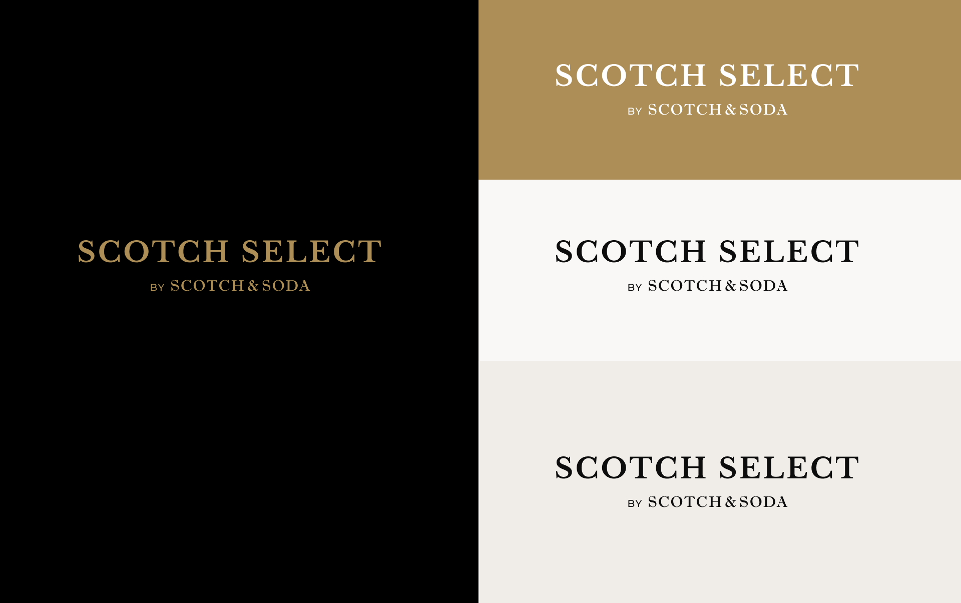
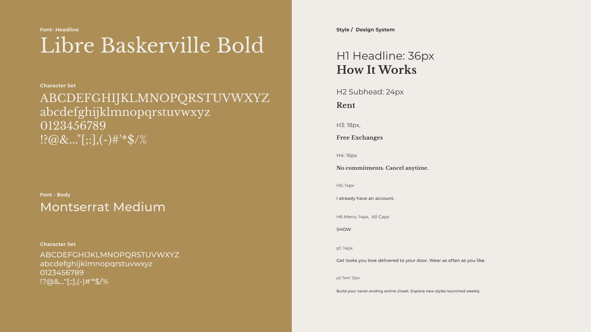
Color / Typeface
A restricted accent palette pulled from Scotch & Soda's existing library (black, white, and Scotch Gold) let the photography and product carry the visual punch instead of the system itself.
Type: Libre Baskerville Bold for headlines, Montserrat Medium for body and UI. The pairing gives Scotch Select an editorial gravity that signals "premium menswear" , plus a clean utility face that holds up across the small-text demands of email, web, packaging, and retail tags.
Email & Marketing Collateral
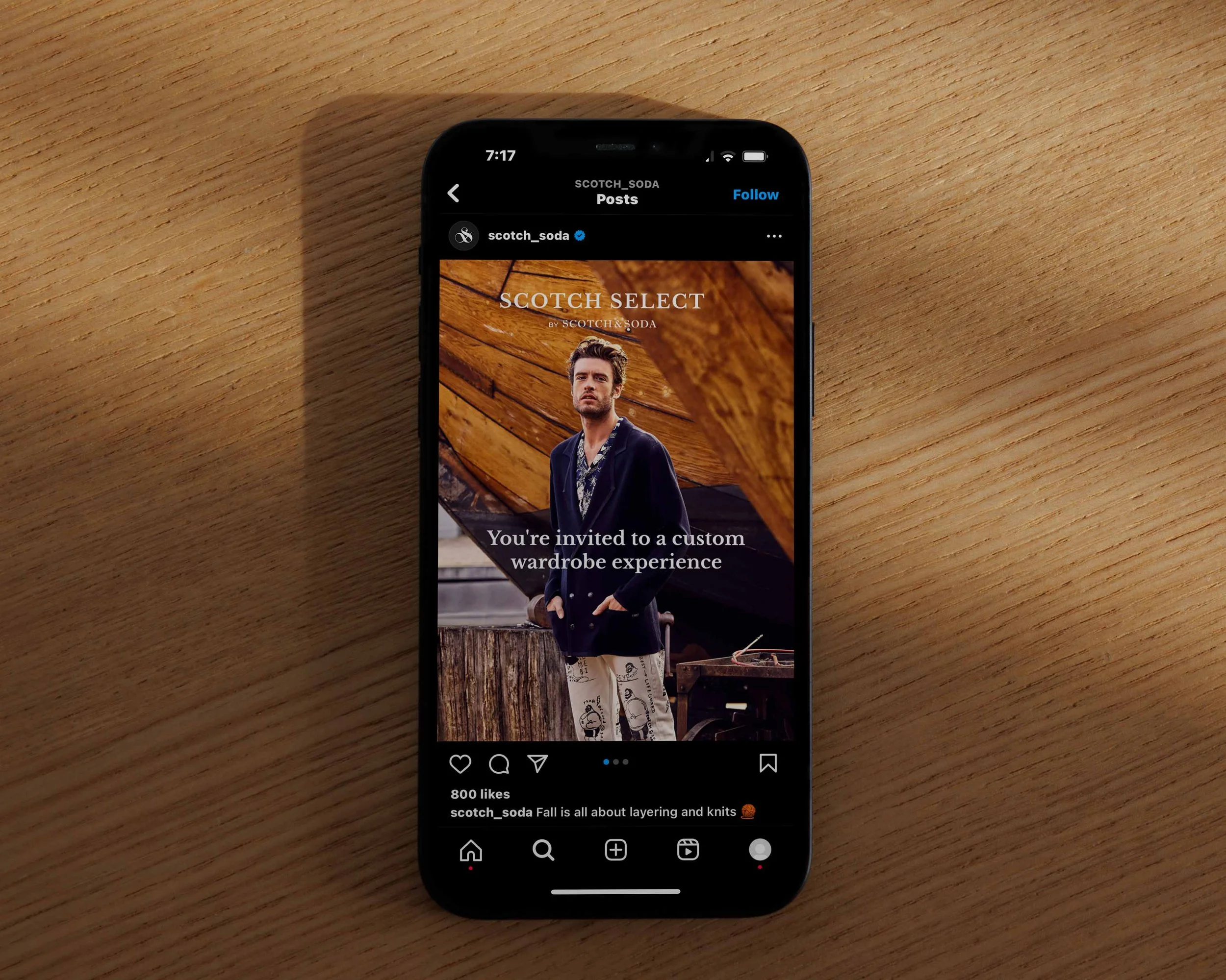
Lifecycle ran on two streams. Guest emails leaned into Scotch & Soda's editorial voice (bold typography, full-bleed product photography, sharp copy lines) to convert browsers into subscribers. Member emails were tighter and utility-first, designed to move members through the rental loop without friction.
I built a modular template system so the marketing team and copywriters could ship the weekly blast without breaking layout or brand standards. Paid social on Instagram and Facebook used the same module logic, so what hit a member's inbox felt continuous with what they saw in feed.


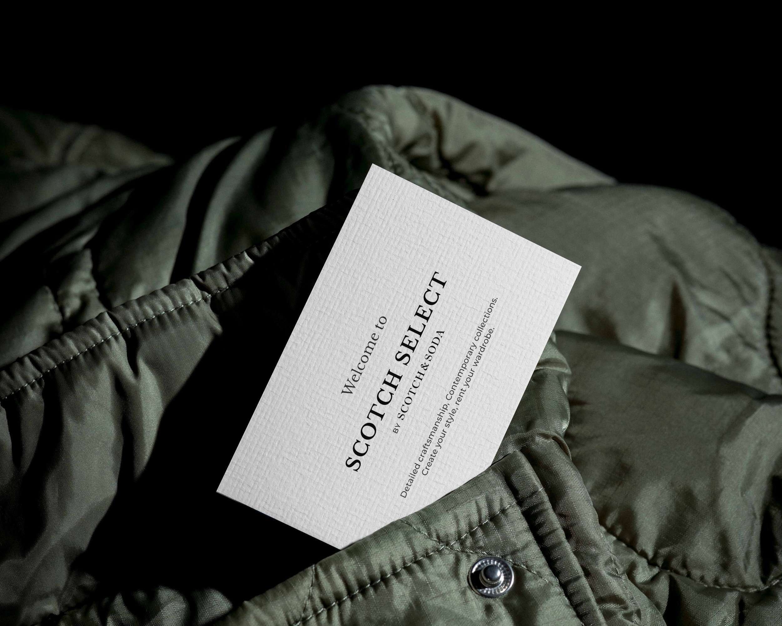
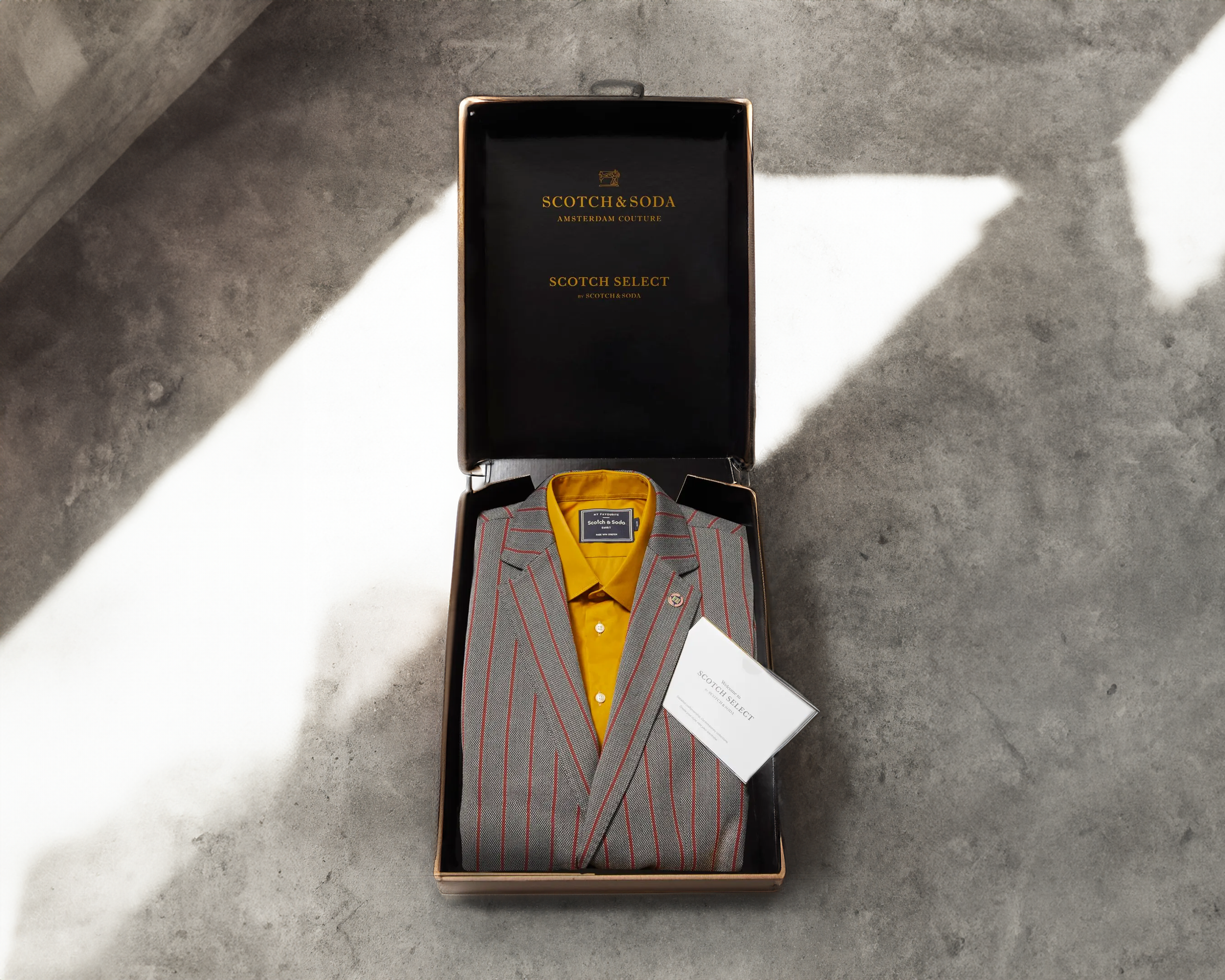
Packaging Design
The exterior carried a single Scotch Select stamp printed under the parent Scotch & Soda mark, so the hierarchy read clearly: this is Scotch & Soda first, Scotch Select second. The inside used branded tape, custom hangtags, and tissue with the sub-brand mark, creating a small unboxing moment that felt earned rather than performed. The result was packaging that protected garments through repeated rental cycles while reading as a deliberate extension of the Scotch & Soda retail experience, not generic subscription fulfillment.


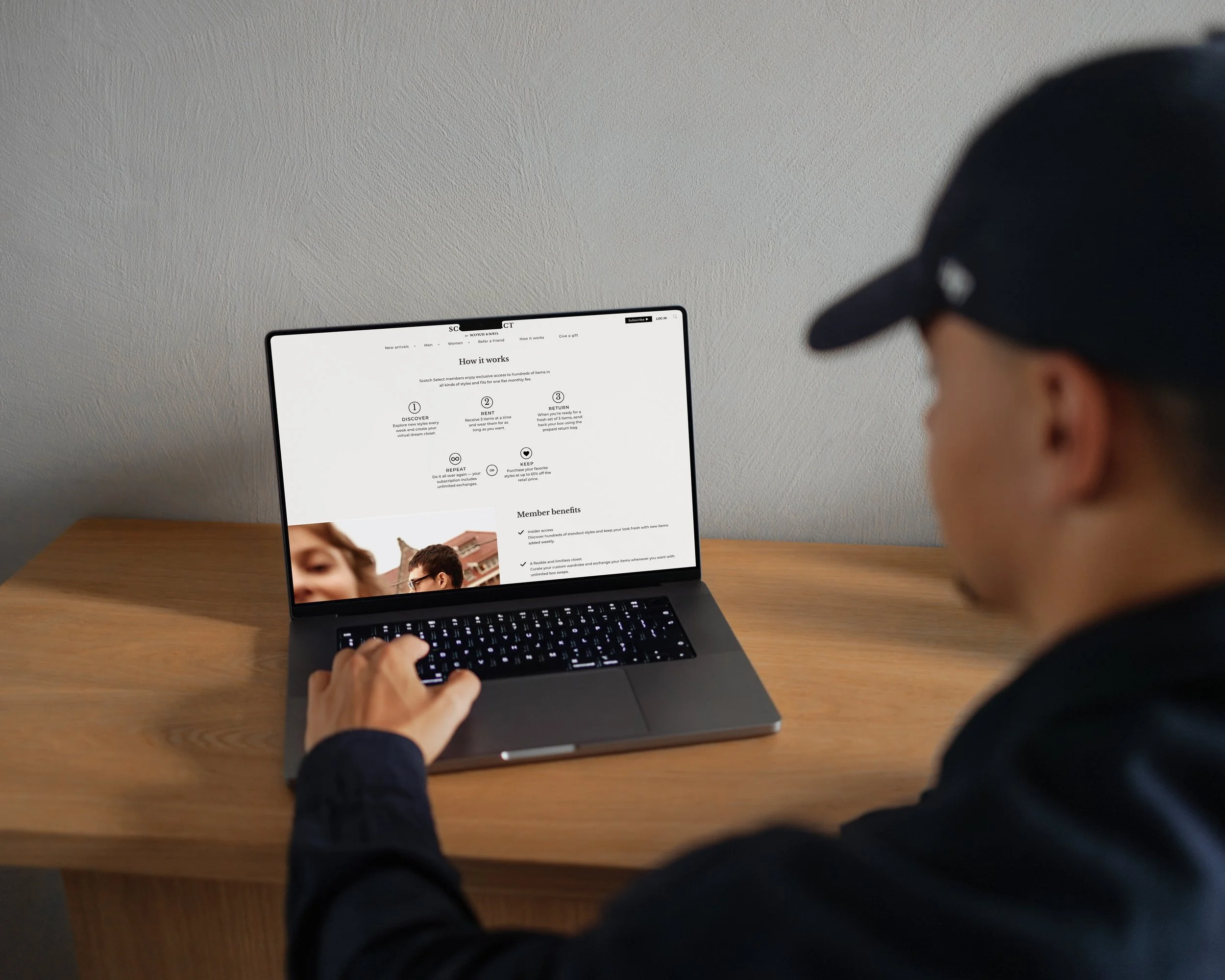
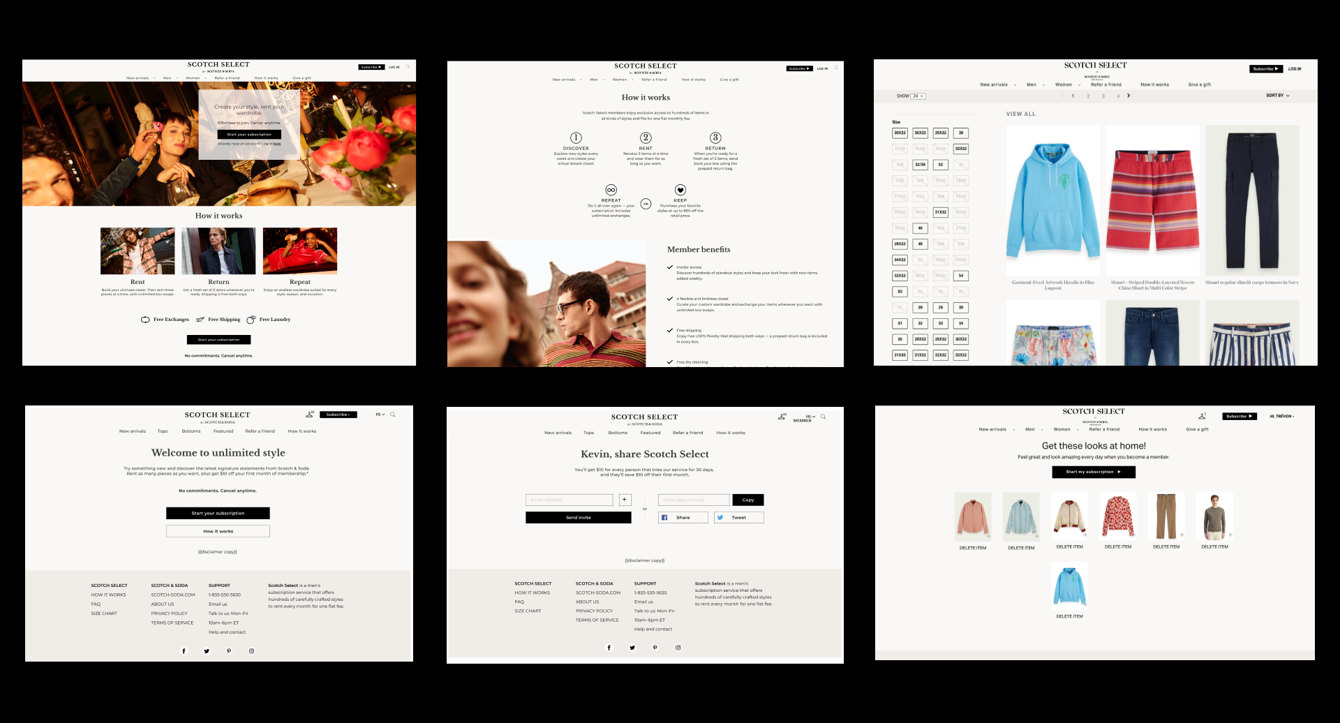
UI System & Design
The Scotch Select site sat on top of CaaStle's subscription engine but had to feel like an extension of main website. I rebuilt the interface around the brand's editorial typography, photography style, and color discipline, then made sure the subscription-specific moments (How It Works, Product Detail, Member Dashboard, Refer a Friend) carried the same voice as the parent site instead of feeling like a CaaStle product in Scotch & Soda paint.
A shared component library kept the team fast across the marketing pages, e-commerce pages, and member experience. Same components, same typography, same spacing, page after page. The brand stayed coherent as new pages shipped.


RESULTS
Scotch Select launched as CaaStle's first menswear rental subscription. The brand system held up across every channel we shipped (packaging, email, paid social, retail tags, and the full member UI) with no production drift over the program's run. The modular email and ad templates let the team ship 50+ pieces of brand collateral a month without breaking the system.