

Vince. Unfold
Vince Unfold was Vince's first subscription business.
Premium apparel, rotating monthly, operated by CaaStle. The brand challenge was real. Vince is built on quiet, restrained luxury, and subscription products tend to be loud. Coupons, urgency, oversized CTAs. None of that fits a brand whose identity lives in restraint.
I led design across the launch and operation. The work was translating Vince's brand language into every subscription touchpoint (packaging, email, paid social, member UI) without losing the minimalism that makes Vince feel like Vince.
Client
Vince.
Role
Creative Lead / Senior Graphic Designer
Agency
CaaStle
Logo Design / Lockup
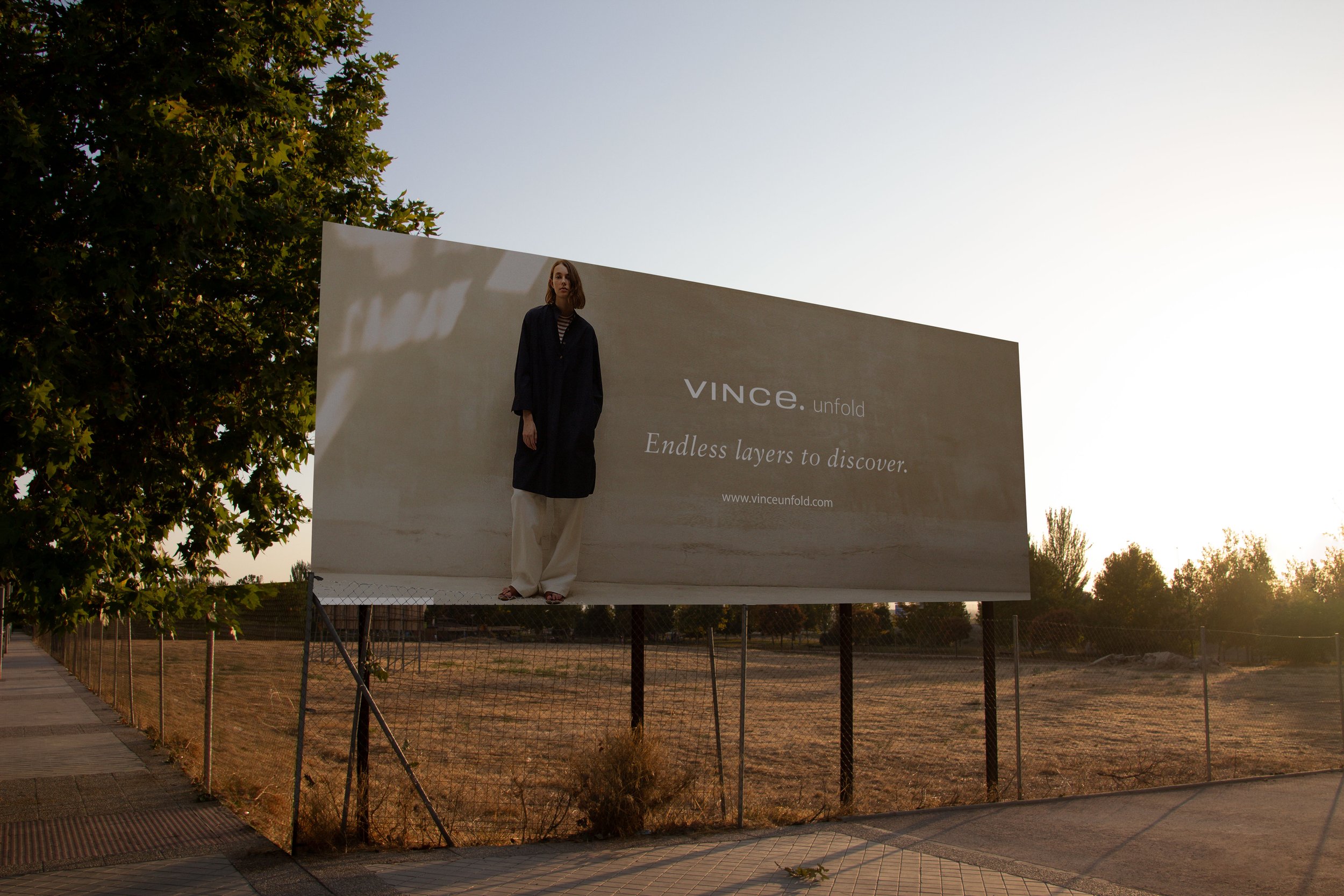
Vince's wordmark is sacred. Clean sans, all lowercase, single weight. Adding "Unfold" to it meant respecting the typographic system rather than redrawing it. The lockup extends the existing wordmark with the same letterforms and proportions, so "unfold" reads as a chapter of the Vince brand instead of a new sub-brand competing with it.


Email & Marketing Collateral
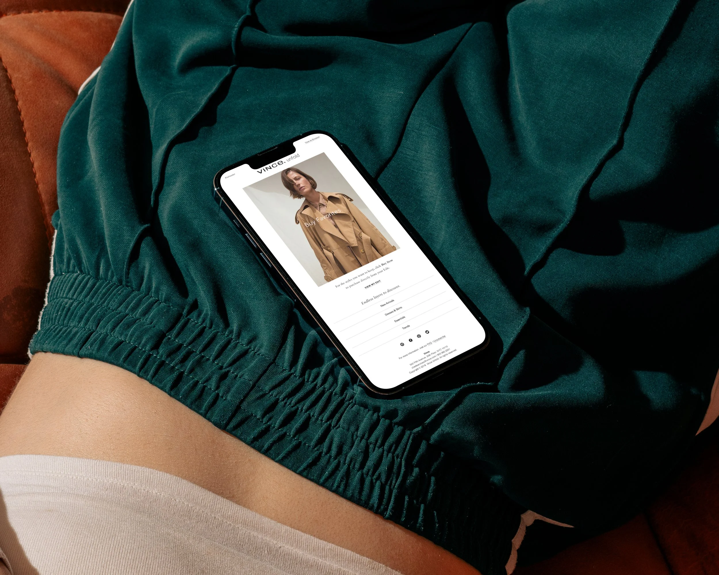
Lifecycle ran on two streams. Guest emails to convert prospects, and member emails to drive closeting (the action that closes the rental loop). I built a modular template system with back-end variables so the marketing team could swap copy and imagery without breaking the layout.
Paid social mirrored the email modules.

Packaging Design
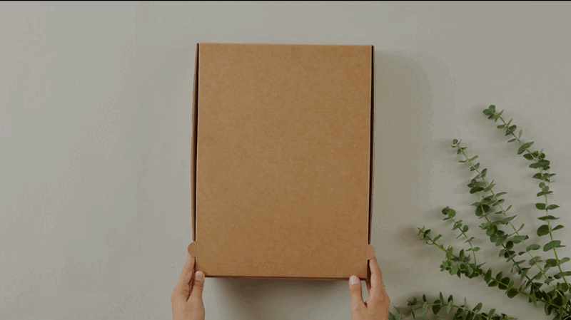
Three box sizes accommodated the range of garment dimensions in the program. The exterior was kept simple. No extra branding, no marketing copy, so the box itself carried the same restraint as the brand. The inside was where the brand revealed itself: a clean Unfold mark, considered tissue, and a tape application that read as part of the design rather than industrial shipping. The result was packaging that protected high-value garments through shipping and rental returns while feeling like a piece of the Vince experience instead of fulfillment.

UI Design
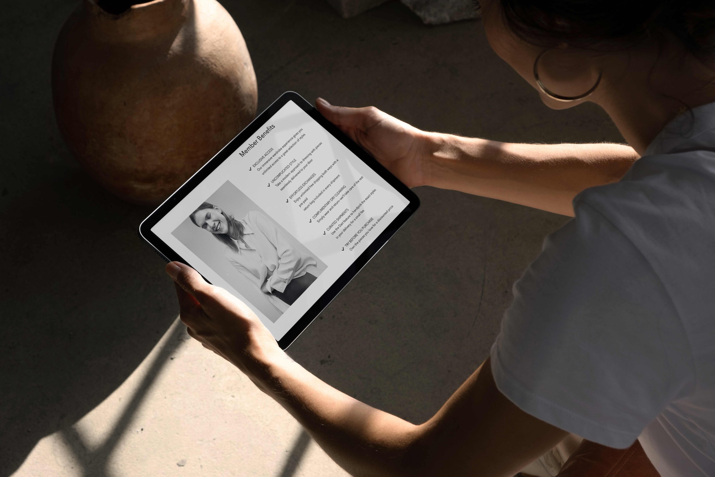
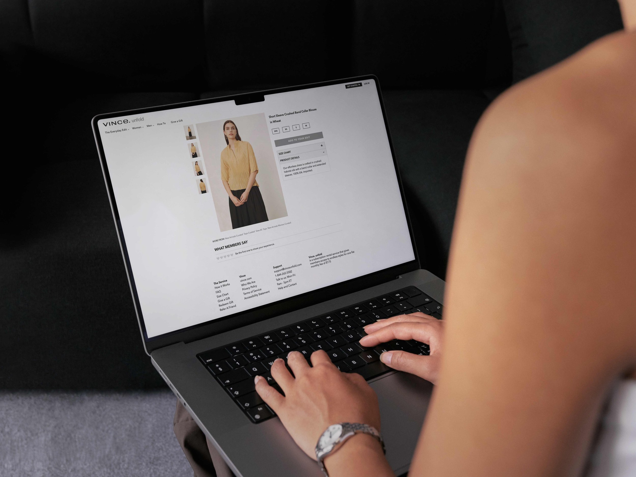
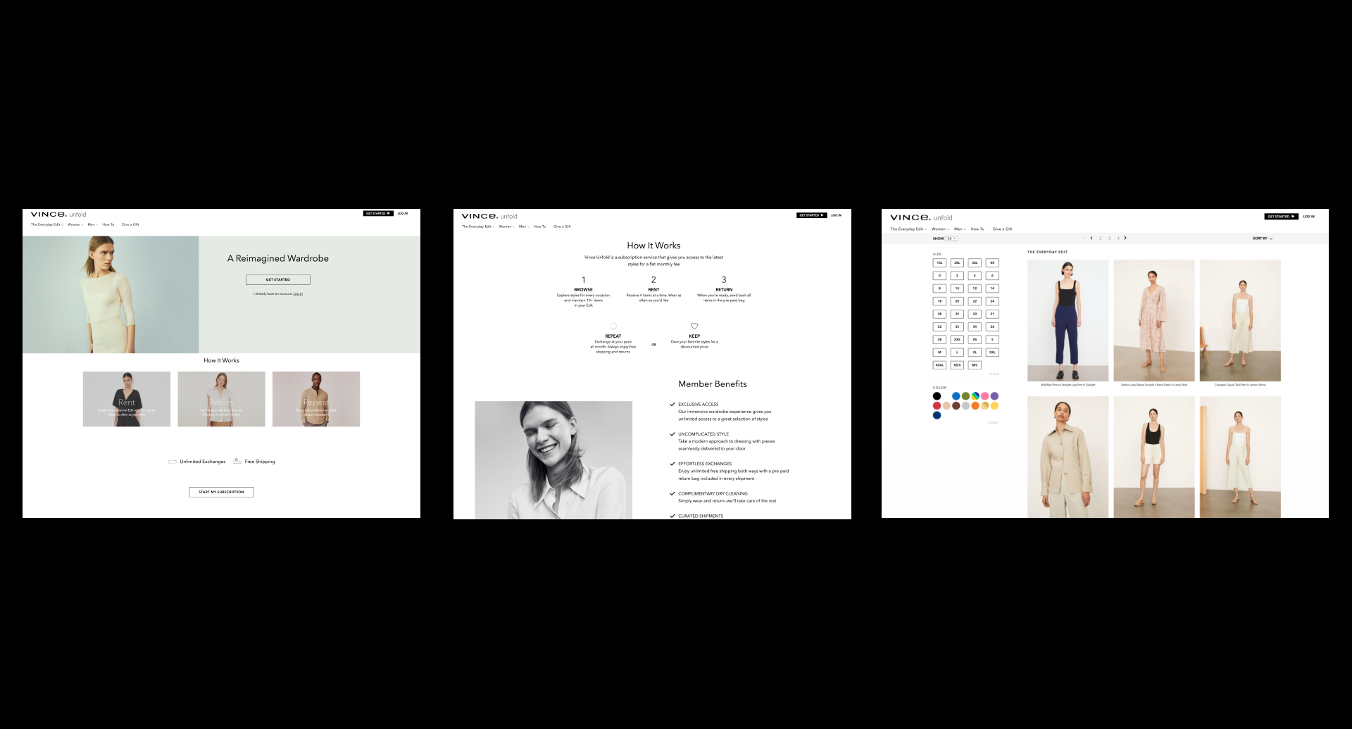
We adapted our platform to Vince’s aesthetic so the subscription site felt seamless with the main site. Clean layouts, generous whitespace, and clear type solved for clarity and kept brand imagery front and center. A shared component library solved consistency and speed across major pages such as How It Works, Home, Product detail, Member dashboard, and Refer a Friend.
The subscription site had to feel like part of vince.com, not a product wearing Vince colors. I rebuilt the templates around Vince's existing type scale, then let the photography do the heavy lifting on every key page (Home, How It Works, Product Detail, Member Dashboard, Refer a Friend).
A shared component library kept layouts consistent across the team and let us ship new pages fast.
Results
The system shipped 50+ pieces of brand collateral a month with no production-quality drops, supported by the modular email and ad templates.
Member satisfaction lifted 15% after a round of UX improvements I led with the research team.